
The semantic scales study provides data based on a semantic differential questionnaire administered to 600 individuals. Several semantic scales corresponding to the physical attributes were presented to the respondents. The figure below shows a sample scale for “Processing Power”.
Crucial information is derived from these questionnaires: brand perceptions, ideal value along each scale, ideal value evolution, brand maps and ship between brand attributes and brand perceptions.
Brand perceptions. Respondents are asked to rate each brand on a scale from 1 to 7 according to the way they perceive the brand. The reported results are summarized in a table such as the one in Figure 25, using the mean value for each brand. For example, a brand rated 2.3 on the Power scale is perceived as being less powerful than a brand rating 5.5 on the same scale.
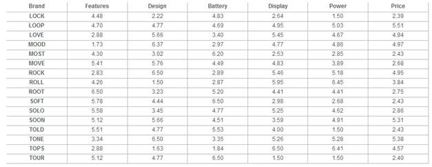
Figure 25 – Market Research – Semantic Scales – Brand perceptions
Ideal values. Respondents are also asked to indicate their preferred (also called “Ideal”) value on each scale. The reported results are summarized in a table such as the one in Figure 26, using the mean value for each segment.
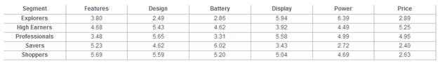
Figure 26 – Market Research – Semantic Scales – Ideal values
Importance of characteristics. Finally, respondents are asked to rate the importance of each characteristic in their purchasing decision. Although consumer segments differ on the exact importance attributed to each characteristic, they tend to agree on the ranking of the scales, i.e. their “relative” importance. This is why only average values are reported on the chart of Figure 27. Ratings are given on a scale from 1 (not important) to 10 (very important).
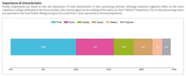
Figure 27 – Market Research – Semantic Scales – Importance of characteristics
Brand maps. Additional charts and graphs are available in the study. Brand maps provide a graphical representation of ideal values and brand perceptions on two dimensions at a time. Five maps are provided in the study.
Ideal value evolution. The study monitors the evolution of consumer needs over time. The preferred values on each scale over the past 3 years are recorded and displayed in a table for each consumer segment, as shown on Figure 56.
Additional graphs. The charts and graphs listed above are given in the main report of the study. Two additional series of charts can be found by clicking on a link at the top of the study. The first series will provide you with a graphical representation of ideal point evolution since the beginning of the simulation. The second series shows the relationships that exist between brand physical characteristics and brand perceptions. These charts are mostly used to design R&D projects are discussed in more details in chapter VI.