Markstrat provides a comprehensive list of graphs to help you monitor the evolution of key performance indicators over time as well as to allow you to compare your results to the ones of your competitors.
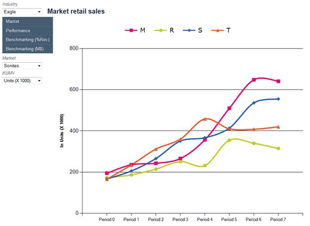
A sample graph is depicted in Figure 3. Use the top-left menu to navigate through the list of available graphs and use the choice boxes to zoom in a particular market, segment or channel or to select to view data in volume or value.
Graphs in the Market menu will allow you to plot the evolution of market sizes, market growth rates, segment sizes, number of marketed brands and pricing data.
Graphs in the Performance menu will allow you to plot the evolution of company key performance indicators such as total sales, market sales, market shares, segment sales, segment shares, channel shares, profits, return on investment and share price index.
Finally, graphs in the Benchmarking menus will allow you to compare your revenues, costs and profits with the ones of your competitors. Most costs are listed here: cost of goods sold, inventory costs, advertising, commercial team, R&D, market research. Prices can be compared as well. These graphs are available in million dollars or in percentage of revenues.
Figure 3 – Charts > Sample chart